
Samadhi Reiki
Oklahoma City, OK
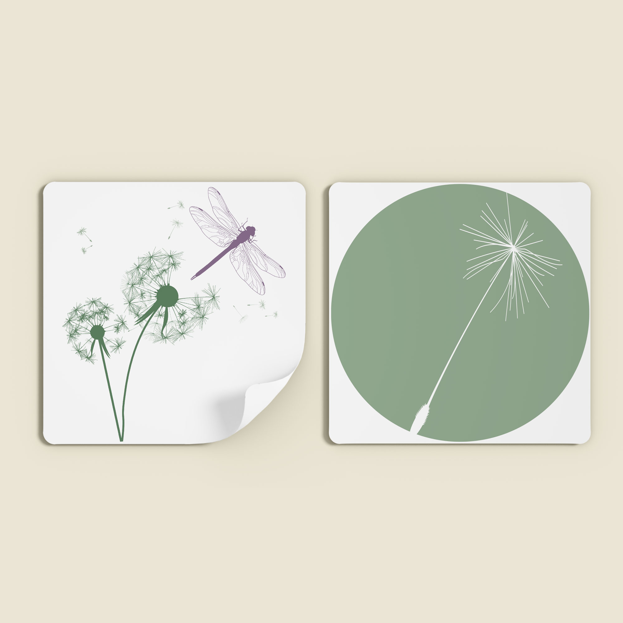
Project Rationale
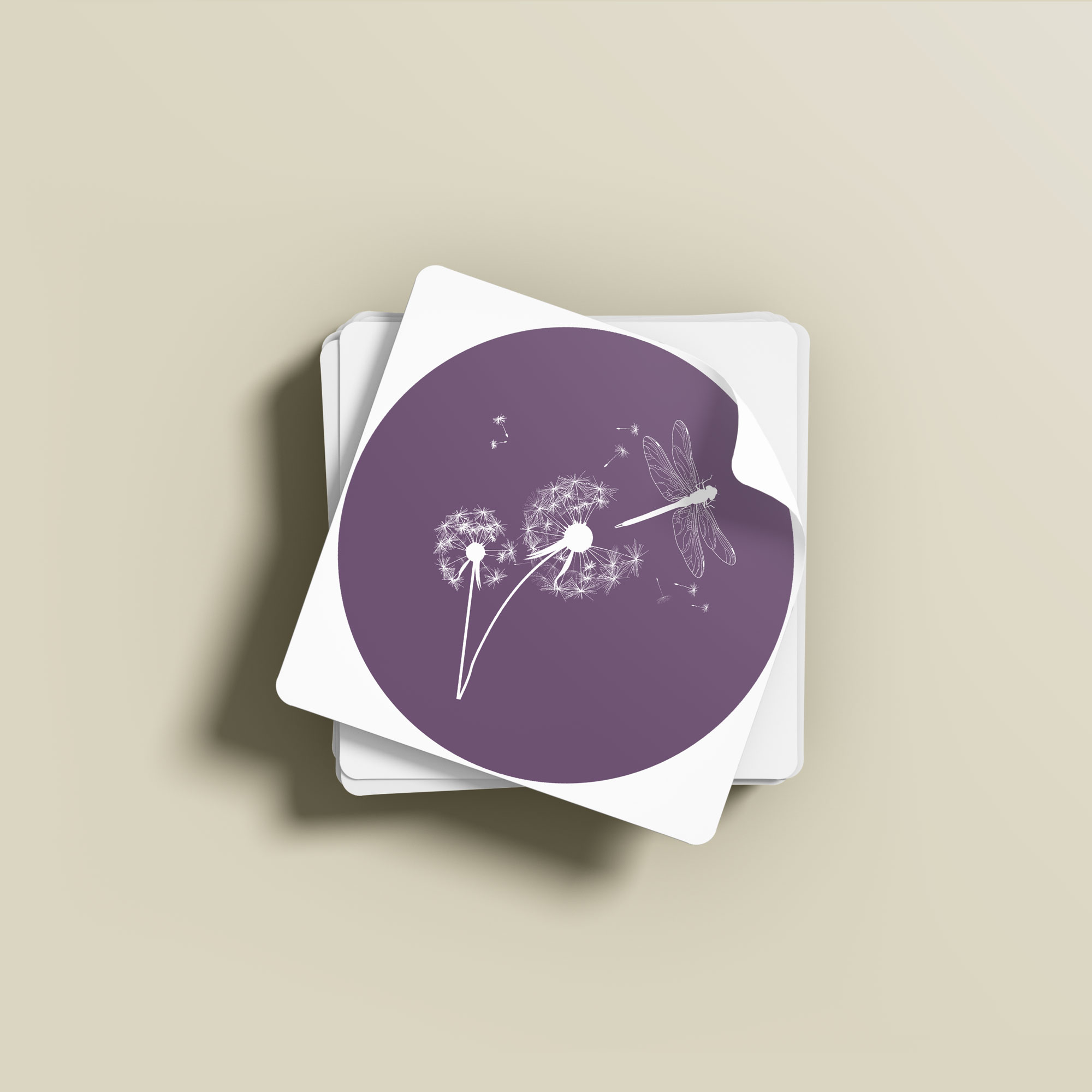
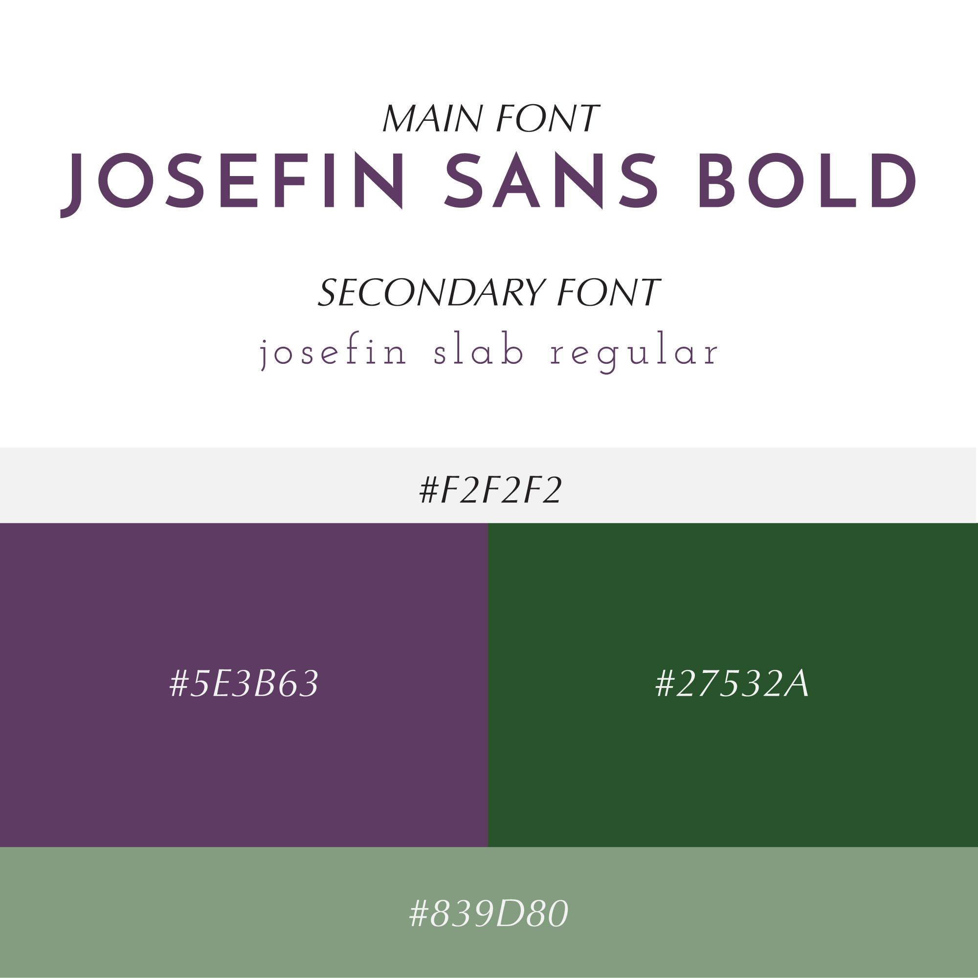
The Samadhi Reiki project started when I was presented with a captivating hand-drawn depiction of a dandelion and dragonfly from the client. The sketch was brimming with shading and our task was to translate this artwork into a versatile vector file, along with carefully selected typefaces to complete branding. We needed to ensure legibility while preserving the original, whimsical aesthetic across various sized platforms, like print or web. Ingeniously, we incorporated a single dandelion seed into the capitalized "D," of Samadhi, creating a seamless connection to the original artwork. The culmination resulted in three submark versions, ideal for effortlessly imprinting the brand's essence on social media posts and beyond.